Introduction
Welcome to the sixth project in our Top React JS Projects for Beginners 2023-2024: Learn & Build journey. This will be the second project that has been built in 2024.
This tutorial offers a straightforward guide on how to build an interactive and beginner-friendly todo application with a simple UI/UX. The technologies to build this React JS application include Next.js, TypeScript, and TailWind CSS. The todo application is a practice tool that is used to manage tasks by many people daily. It helps you to remind yourself what needs to be done and encourages people to stay motivated by accomplishing them. Thanks to this simple yet powerful feature, it is the application that a lot of people are interested in to build it themselves (like yourself!).
That being said, let’s get started and I hope you have lots of fun following this tutorial.
Design And Requirements
This section shows the design and requirements to build the todo application.
If you want to build the application on your own without following the guide, you can refer to this section to successfully build the todo application.
NOTE: If you have a different taste of mine in terms of the design, don’t hesitate to play around with it and change them!
Design
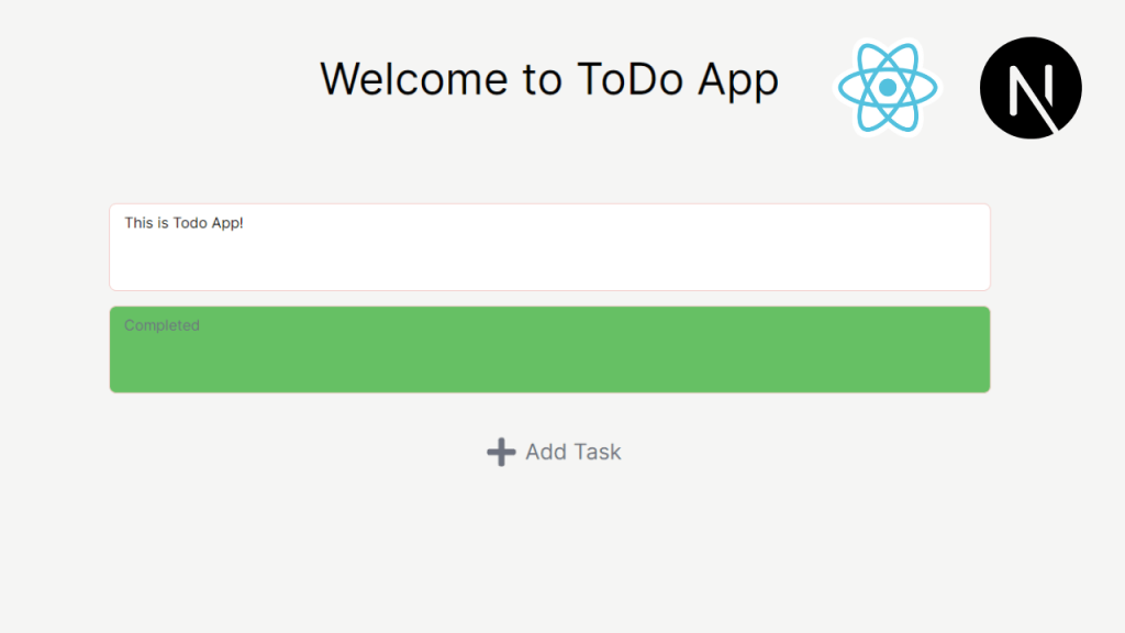
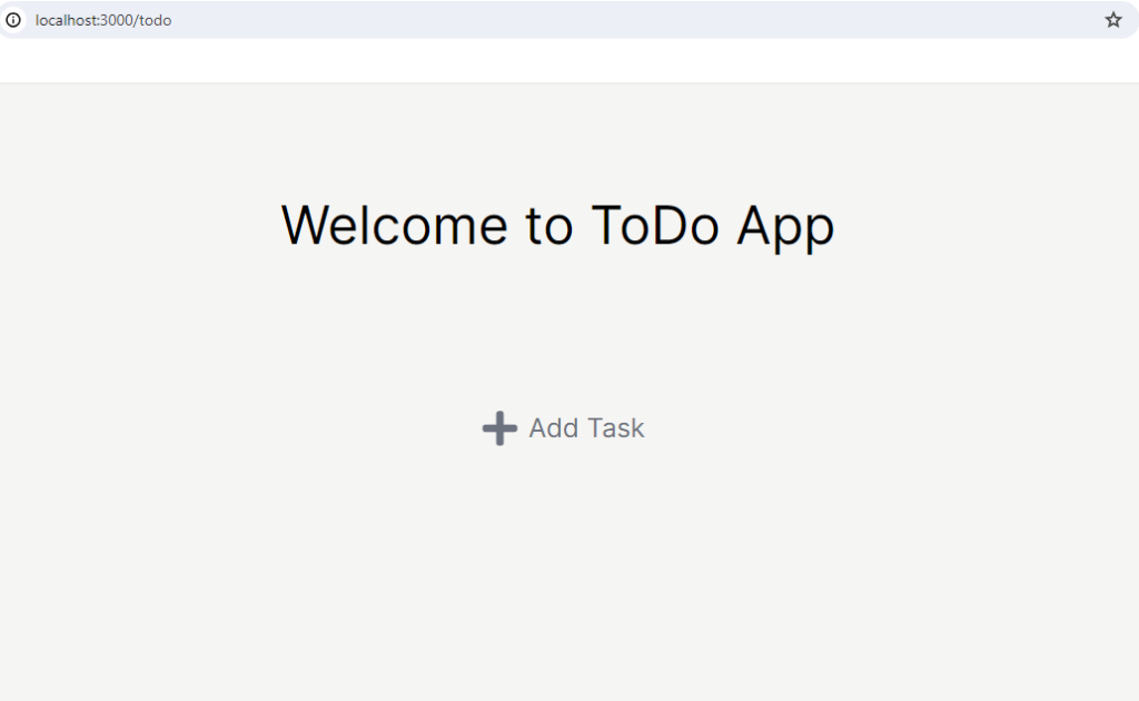
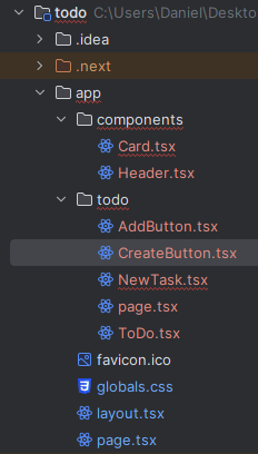
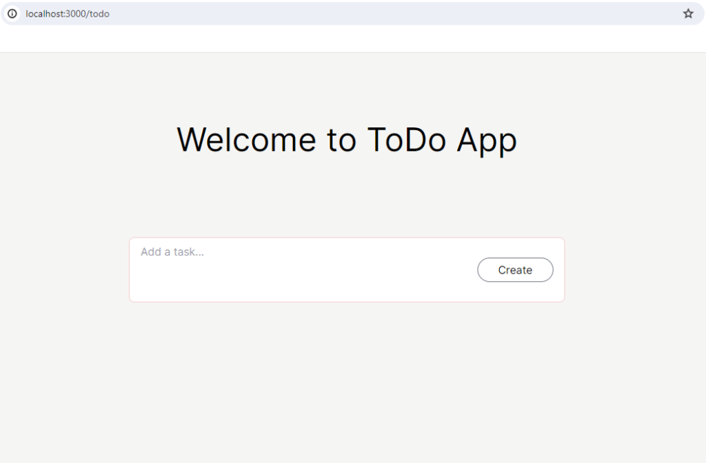
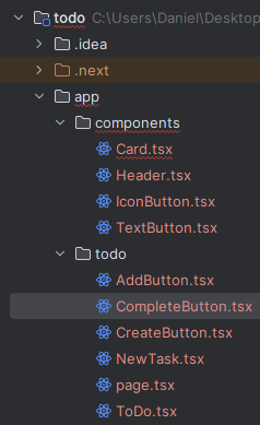
The image below is the final outcome of our todo application.
Since this tutorial will contain a lot of CSS styling, I can’t give you every single detail of them. However, I will give you the general colors and fonts that I’ve used to build this application.
– App background color: bg-stone-100
– Task card (incomplete) color: bg-white, border-red-200
– Task card (complete) color: bg-green-500, border-red-200
– Add button and text: text-gray-500, FaPlus
– Create button: hover:bg-blue-500, hover:border-blue-500
– Complete button: hover:bg-green-500, hover:border-green-500, FaCheck
– Undo (Revert) button: hover:bg-yellow-500, hover:border-yellow-500, FaUndo
Requirements
These are the requirements of the todo application.
The todo application can:
– Show a new task card when AddTask icon or text is clicked
– Show the newly created task card and AddTask icon and text below the card when the create button is clicked
– Change the color of the card to green and do not allow to type in the card when the complete button is clicked
– Change the color of the card to white and allow to type in the card when the undo (revert) button is clicked
With the design and requirements all laid out, let’s get to the hands-on coding and start building the todo application.
Each step on this tutorial will include corresponding code examples to help you understand better. However, if you decide to just read it through and check out the code I posted on my Github, you can visit this todo application Github repo.
Setting Up Next.js App
The todo application will be based on Next.js just like the previous tutorial (the flashcard application). If you have previously completed the flashcard tutorial, you probably already know how to set up the Next.js application. However, for the new readers who are just starting out Next.js, I will outline the steps below.
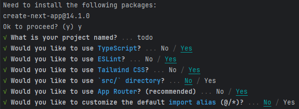
Below are the steps to set up the Next.js application.
npx create-next-app@latestThen, you will see some prompts that ask some questions regarding project configuration. You can accept the default values for all the questions.
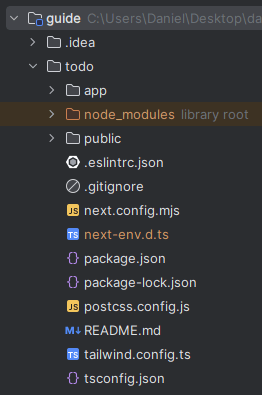
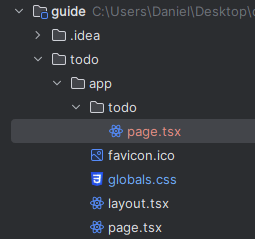
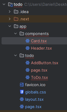
Once the process is successfully completed, you should be able to see the project folder structure like the below image.
You can now go into the project folder that you just created and start the local Next.js server!
cd todo
npm run dev
If you click on the link (http://localhost:3000) that’s provided or type it in the browser URL, then you should be able to see the bootstrapped Next.js page.
Create Todo Page
Implement basic todo page
Let’s create a page for todo tasks. We are going to call this page ‘todo‘. This means that we need to create a route that is http://localhost:3000/todo.
Before we start adding contents into the todo page, let’s get rid of the global CSS styling that came with initial Next.js setup. Remove everything in globals.css file except these three lines.
@tailwind base;
@tailwind components;
@tailwind utilities;
This will give us clean state of CSS styling. As a next step, let’s create a folder called todo under the app folder and add a file page.tsx.
Inside the page.tsx, let’s include some basic content.
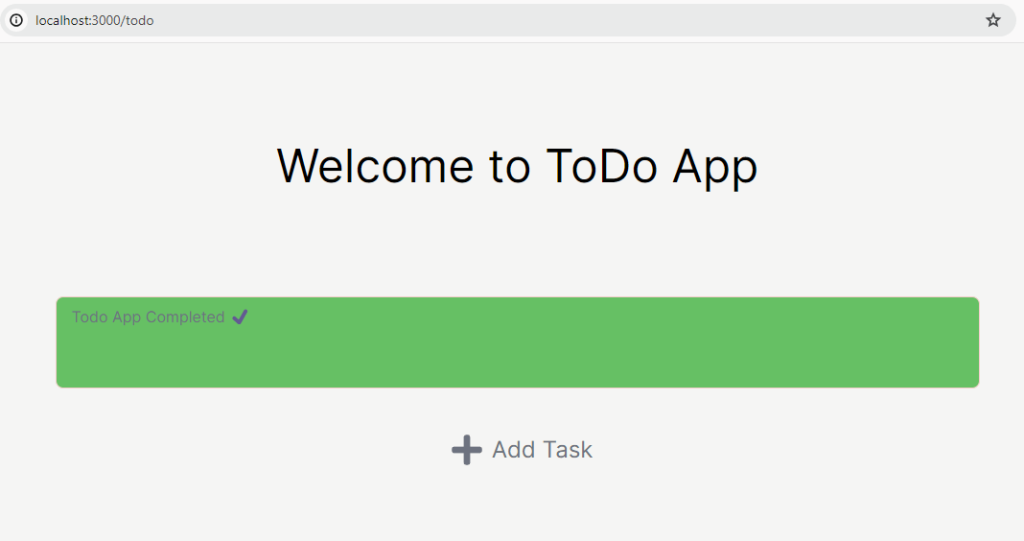
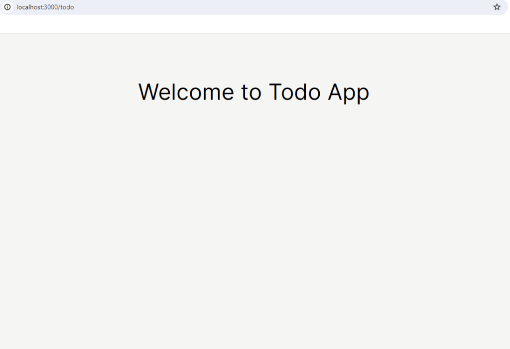
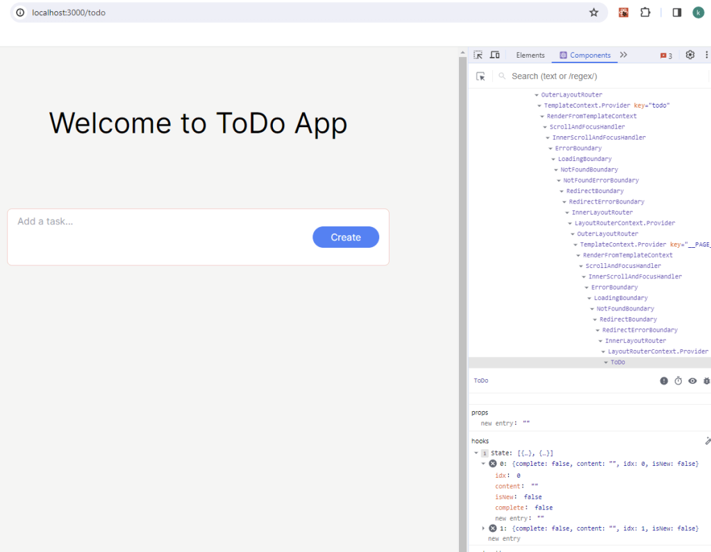
Now, if you go to the todo endpoint (/todo) in browser URL, then you should be able to see the welcome message displayed.
Since the todo folder we added has the page.tsx, we have the /todo endpoint. As we pointed out in the previous Flashcard tutorial, this is the Next.js’ feature.
Refactor welcome message to header component
The applications from the previous tutorials had the welcome message in a main page as a component. From the current tutorial, we are going to take advantage of Next.js. Next.js has a file called layout.tsx. You might have noticed this file along with the page.tsx that has been created in the beginning. As the name suggests, the layout.tsx file is how the page is going to be laid out. Here is the detailed explanation from the Next.js official documentation for layouts.
Let’s create a folder components under the app folder. Then, create a file Header.tsx under the components folder.
Then, let’s move the welcome message to Header.tsx.
Once we have the Header.tsx component, we can apply this to global layout, which is layout.tsx file under the app folder.
Finally, we can remove the welcome message from the page.tsx under todo folder.
Perfect, you should be able to see the same welcome message as above.
Set todo page as main page
Our todo application doesn’t require users to sign in to use the service. So, this means that we can set the /todo endpoint as our main page. This can be achieved by adding a simple line of code in our main page.
Add this line below to the page.tsx under app folder.
Now, when you access http://localhost:3000, it will automatically redirect to http://localhost:3000/todo.
Create Add Task Button
Implement the Add Task icon and text
Let’s start with building a button that would make us be able to add a new task. This will contain a plus (+) icon as well as ‘Add Task‘ text. Create a file AddButton.tsx under the todo folder.
In order to add a plus icon, we need to first install react-icons package.
npm install react-icons --saveThen, we can use this AddButton component in our page.
If we go back to the browser, we should be able to see something like this:
Refactor the code into ToDo component
Our code is successfully working, but I’d like to have a better separation by abstracting some HTML tags into components.
Let’s create a file ToDo.tsx under the todo folder. After creating the file, we can move the code that we used in page.tsx.
Then, we can simply use ToDo component in page.tsx.
Awesome! Personally, I find this to offer improved semantics, and it will facilitate other developers in swiftly engaging with the code.
Create Task Card
Implement Card component
The Card component would be the main component in our todo application. This component will hold a space (textarea) for user input and a button (add, complete, or undo depending on the status of the task). Create a file Card.tsx under the components folder.
Here is the code for the Card.tsx for now. This will be modified as the tutorial progresses.
We can use this Card component in our ToDo component.
Now our application would look like this.
Don’t worry about the Card component and the AddButton component showing right next to each other. We are going to make a change so that we can only see either one at a time.
Implement NewTask component
Like we mentioned above, we are going to show either the new task or the add task button. When we click the AddTask button, it will disappear and show the new task card. When we click the create button (which we haven’t implemented yet) in the new task, it will register the new task as our task and show the AddTask button again below the new task.
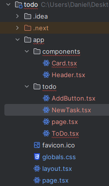
Let’s go ahead and create a file NewTask.tsx under todo folder.
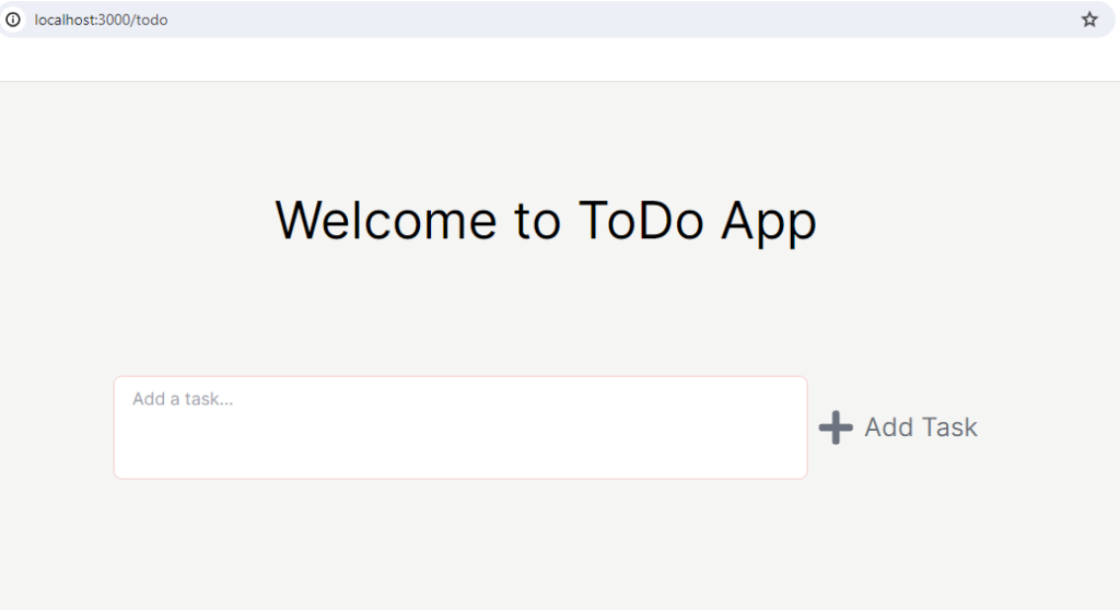
We can add content this in NewTask.tsx for now. This should let you click on Add Task button and open up a new task card.
We can use NewTask component in the ToDo component.
Since we are now able to open up a new task card, we need to be able to add this task to our task list by clicking create button on the task card. First, let’s implement the create button inside the task card. Create a file CreateButton.tsx under the todo folder.
Then the code below is what I wrote for the CreateButton.tsx.
We can use the CreateButton component inside the Card component.
We also need to modify the NewTask component as well because we are maintaining isNewTaskClicked state from the NewTask. That’s why we are passing down handleOnTaskClicked handler to the CreateButton component.
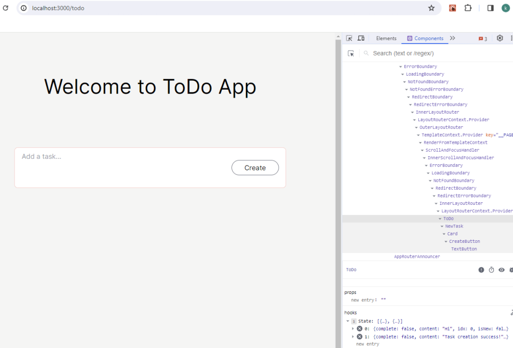
If you click on AddTask button, then it should switch to NewTask component with the CreateButton component. The new task card with the CreateButton component would look like this.
Excellent! Good job on following through the tutorial. At the moment, all it’s doing is toggling between AddTask button and the NewTask component. Our next goal is to add a new task into the list of tasks when the create button is clicked.
You might have noticed that we have some duplicate codes for the buttons. So, before we start implementing the adding a task into the list feature, let’s refactor our code.
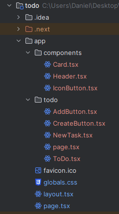
In our todo application, we are using two types of buttons. One button type contains only an icon, while the other type consists solely of text. Let’s take care of the buttons that only have an icon. Create a file called IconButton.tsx under the components folder.
Then, we can implement IconButton.tsx.
We are using an icon only inside the AddButton.tsx. We can replace the button with the icon with IconButton component now.
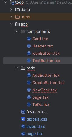
Next, we also have a button that has text only, which is a create button. We are going to create a file TextButton.tsx under the components folder.
Here is the code for the TextButton component. It is very similar to IconButton component but slightly different.
The CreateButton component only has the text inside. So, we can replace button element implementation to TextButton component.
Perfect! Now, go back to your application and test to see if everything is working intended. It’s essential to run some tests after each refactoring. In our case, since we are not writing any test code, we can manually check whether the application is running correctly.
Implement The Functionalities
Until this point of the tutorial we basically created most of components that the application needs. Now the fun parts begin – interactivity!
Add a new task into the task list
The CreateButton that we have now doesn’t actually add a new task into the task list. It just toggles the AddButton component back to the browser. But this is not exactly what we want, is it? We want to add this new task to the task list. In order for this to work, we need to have a state that stores tasks. The ToDo component will be the right place to have this.
Next, we are going to have a state for the new task in the NewTask component.
Since the function handleCreateButtonClick is being passed down as a prop handleCreateTaskOnClick, we need to modify the Card component as well.
Go back to the browser and then test the application out. If you click the create button, it should be adding a task into the task list.
Update the new task content
Although we are able to add a new task into the task list, the task doesn’t have any content saved. This is because we haven’t implemented saving the content of the new task.
The state newTask resides in the NewTask component. So, we need to implement a handler here and pass it down to the Card component.
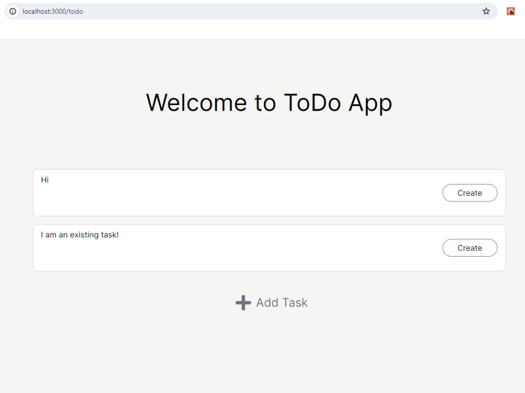
Now, when you input some texts in the user input area and hit the create button, we can see the content actually is showing for each task.
Show the existing tasks
Now that the tasks inside the task list have contents , let’s proceed to display them. To achieve this, we’ll need to make some adjustments to the ToDo and Card components.
Let’s start with the ToDo component.
Then, we can use content prop in the Card component.
NOTE: I’ve passed some other things as props along with content. This is because they are going to be used soon for other functionalities.
If you go back to the browser and add new tasks, they will show up with the content you typed in.
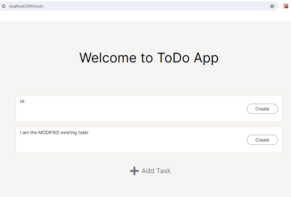
Awesome! But you might have noticed that after the existing tasks show up, if you try to modify them, the content won’t change. This is what we are going to take care of next.
Modify the existing tasks
Currently, the Card component is being used in two places. One place is the ToDo component and another one is the NewTask component. When the content of the card in the NewTask is being updated, what’s really being updated is the newTask state. If we want to modify the existing card, we would have to modify the tasks state which is in the ToDo component.
So, let’s go ahead and implement a function that can take care of both cases in the Card component. You can think of this function as a controller that decides which function to call.
If you look at what’s inside the handleOnChange function, you can see we are calling two different functions: handleNewTaskContentChange and handleContentChange. We already have the handleNewTaskContentChange function but there is a small change we need to make in the NewTask component. Since we need to distinguish whether the card is new or not, we need to pass isNew flag into the Card component in the NewTask component.
Next, we need to implement handleContentChange function in the ToDo component.
Now, you should be able to modify the existing tasks as well as the new task card. 🙂
Implement Complete And Undo Button
As a task management application, users should have the ability to mark tasks as completed or mark them as incomplete. At the moment, if you create a task, you will still see the complete button on the task card. We are going to change this to an icon button that has a check mark with the green background.
Let’s create a file CompleteButton.tsx under the todo folder.
Then we can implement the CompleteButton component like below.
The CompleteButton component will reside in the Card component. So, we would need to make a change to the Card component as well.
Let me explain what have changed here. For now, we are conditionally rendering the CreateButton and the CompleteButton based on the isNew. Later on, we are going to add one more condition to render UndoButton. We’ve also added the handleCompleteOnClick function which is calling the handleCompleteChange function that is passed as a prop. The reason that this function is being passed a prop is because that we are modifying the complete field in each task. The tasks are managed in the ToDo component.
Depending on the complete prop, we are changing the styles of the card. On top of that, we are making the card as read-only mode if the task is completed.
Now then, let’s modify the last component: ToDo.
If you click on the complete button, then you should be able to see the task changed.
Occasionally, situations arise where we need to undo a completed task. This could be due to accidental clicks on the completion button or because a task was mistakenly believed to be finished when it wasn’t. 🙁
Let’s create a file called UndoButton.tsx under the todo folder.
The UndoButton component will be the exactly same thing as the CompleteButton but with a different icon and color.
Now, we can add one more condition to render the UndoButton component inside the Card component.
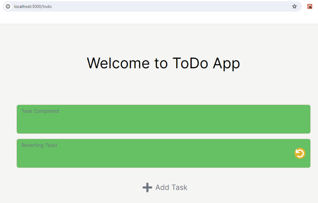
You should be able to undo the completed task after clicking the undo button.
Conclusion
Excellent job on making it through until the end! Now you have the fully working todo application on your hand. This is the end of our sixth React JS step-by-step tutorial.

From this tutorial, we were able to learn the following:
– How to set up React JS application featured by Next.js
– How to create buttons that contain icon or text only
– How to conditionally render components
– How to update props being passed down to children components
– How to utilize the handler functions being passed down to children components
– How to create re-usable components by refactoring
If you’re planning to improve your skills further, you’re welcome to enhance the Todo application by adding more features on to it. Here are some ideas that I can think of to improve:
– Add a strike-through when the task is completed
– Add a separate section that has completed tasks only
– Add a cool animation on task completion or un-doing
– Add a functionality that blocks creating tasks with empty content
I hope you enjoyed building the Todo application and thank you again for reading. If you are interested in making more React JS projects for beginners, then you can check out our Top React JS Projects for Beginners 2023-2024: Learn & Build post.
If you have thoughts or any feedbacks on the post, be sure to leave a comment.
I also write articles on Medium, so make sure to check them out on medium/@codingnotes.
Happy coding!


Nice app tutorial.
Hi YT,
Thank you!