Crafting A Modern And Convenient BMI Calculator With React JS

Crafting A Modern And Convenient BMI Calculator With React JS Thumbnail

Introduction

Welcome to the fourth project in our Top React JS Projects for Beginners 2023-2024: Learn & Build journey.

In this step-by-step tutorial, we will build a modern and convenient BMI calculator with React JS utilizing Vite, TailWind CSS, and react-circular-progressbar. A BMI calculator is a beneficial utility tool to use when you calculate your body mass index (BMI). You just type your height and weight and boom! It shows you a rough indication of your health status considering your height and weight.

When I was doing some research, I noticed that most BMI calculators have a really outdated look. That being said, we are going to make our BMI calculator app a modern and easy-to-use user interface. Let’s dive in and start building a BMI calculator with React JS.

Design And Requirements

This section shows the design and requirements that need to be implemented to build the BMI calculator application.

If you want to build the application on your own without following the guide, you can refer to this section to successfully build the BMI calculator.

Design

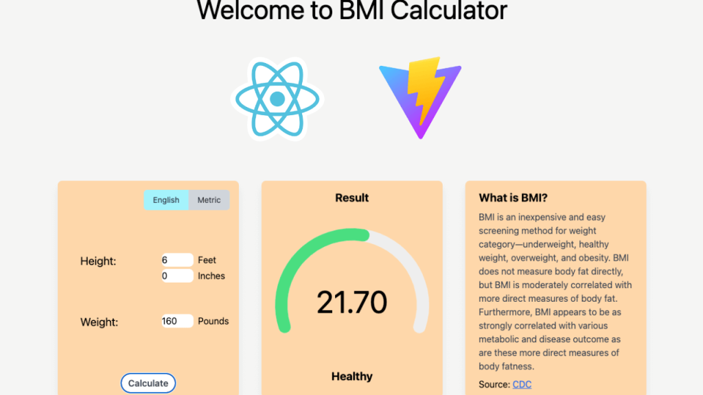
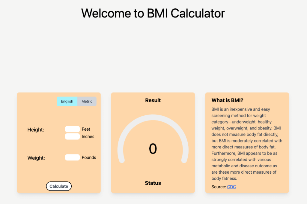
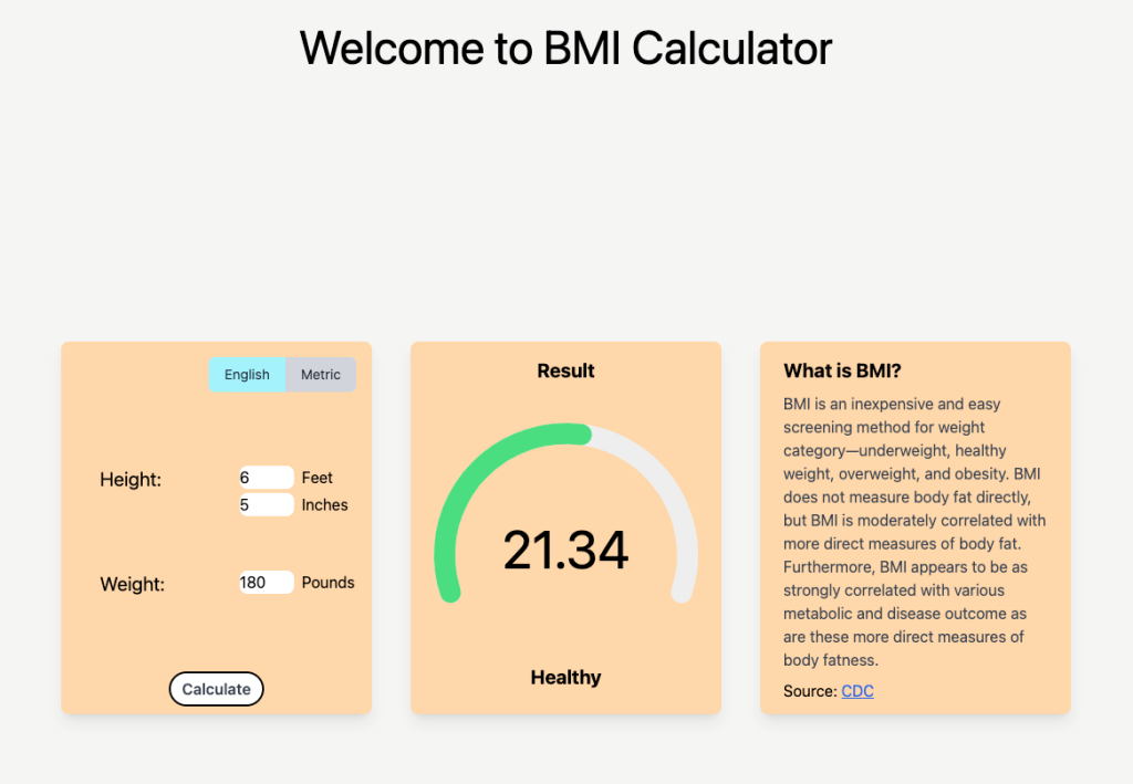
The image below is the final outcome of our BMI calculator application.

The BMI calculator app final outcome

Feel free to use your choice of font, font size, color, etc if you want to change the appearance of the application.

If you want to learn by following the step-by-step tutorial, then you can use these design elements I’ve used.
– App background color: bg-stone-100
– Card: bg-orange-200 w-80 h-96 shadow-lg
– Title font: text-5xl
– Calculate button: bg-white rounded-full px-3 py-1 text-md font-semibold text-gray-700 border-black border-2 hover:bg-gray-100
– Circle progress bar: rotation: 0.7, strokeLinecap: “round”, trailColor: “#eee”, textColor: “#000”, pathColor: “#fddf47” (for underweight and overweight), “#4ade80” (for healthy), “#ef4444” (for obesity)
– Progress status (text below the progress bar): font-bold text-xl
– Description title: font-bold text-xl
– Description: text-gray-700 text-base

Requirements

These are the requirements of the BMI calculator application.

The BMI calculator can:
– Calculate the BMI depending on the height and weight of the user input
– Switch the unit measurement (English or Metric)
– Show the BMI result with the number and a circle progress bar with the corresponding colors
– Show the status (underweight, healthy, overweight, or obesity) right underneath the progress bar

With the design and requirements defined, it’s time to dive in and begin crafting the BMI calculator application.

I explain each step with the corresponding code examples so that you can visualize what’s going on, but if you want to check out the whole code of the BMI calculator application, you can visit the BMI calculator GitHub repo.

Setting Up React App

We are going to use Vite as our scaffolding tool. Below are the steps to set up the Vite application.

First, check whether npm and node are installed on your local machine.

node -v
npm -v

If they are not installed, please check out the section scaffolding with Vite from Word Counter and install them.

If they are installed, run this command to scaffold the project.

# For npm version 7+
npm create vite@latest bmi-calculator -- --template react

# For npm version 6.x
npm create vite@latest bmi-calculator --template react

Now, run these commands to start the local server.

cd bmi-calculator
npm install
npm run dev

The command npm run dev will start running the local server. If you open the link provided by running the command, you should be able to see the running React JS app scaffolded by Vite.

The scaffolded React + Vite app

Install TailWind CSS

Like the previous tutorial (Building An Inspiring Quote Generator With React JS (ft. ChatGPT), we will use the TailWind CSS framework for the BMI calculator application.

The TailWind CSS is a very handy framework for CSS like Bootstrap. In TailWind CSS, we can add the styles right on className each HTML tag. With this approach, we don’t need to have any of the CSS files except the main one that we use to import TailWind CSS. If you want to check out the documentation, you can visit the TailWind CSS official documentation.

Here is the step-by-step guide on how to install the TailWind CSS in the Vite app.

First, since we’ve already created our project, we are going to install the necessary packages.

npm install -D tailwindcss postcss autoprefixer
npx tailwindcss init -p

These commands will download the necessary packages and generate two files – tailwind.config.js and postcss.config.js.

Second, modify the tailwind.config.js.

/** @type {import('tailwindcss').Config} */
export default {
  content: [
    "./index.html",
    "./src/**/*.{js,ts,jsx,tsx}",
  ],
  theme: {
    extend: {},
  },
  plugins: [],
}

The content is modified in this step.

Third, add @tailwind directives in your index.css file. This will be the only CSS file we will be modifying.

@tailwind base;
@tailwind components;
@tailwind utilities;

These will add all of the features that are provided by the TailWind CSS into your project.

Finally, run the server. If you are already running the server, the changes will not be effective right away. So, close the server and restart the server.

npm run dev

Implement Basic Components And CSS

This section covers the basic components (HTML) and CSS of our app. Additional content and CSS will be added accordingly as we go through each section.

Let’s remove the HTML and CSS that were provided to us from the Vite scaffolding. You can delete everything in App.css and index.css.

Implement App.jsx

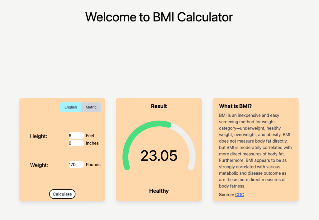
The App.jsx will be our main template to build the HTML structure of the app.

function App() {
return (
<div className="min-h-screen h-screen m-0 bg-stone-100">
<div className="flex h-1/5 justify-center items-center mx-auto">
<h1 className="text-5xl">Welcome to BMI Calculator</h1>
</div>
<div className="flex h-3/5 justify-center items-center mx-auto">
{/* user input card */}
<div className="max-w-sm rounded-lg overflow-hidden shadow-lg bg-orange-200 w-80 h-96 flex flex-col">
{/* toggle container */}
<div>toggle button here</div>
{/* main user input section */}
<div className="px-4 py-4 grow flex flex-col justify-evenly">
{/* height section */}
<div className="flex justify-between mb-2">
<div className="w-1/2 ml-6 text-xl">
<span>Height: </span>
</div>
{/* unit section */}
<div className="w-1/2 flex flex-col ml-6">
<div>
<input type="number" className="mb-1 w-14 rounded-lg" />
<label className="ml-2"></label>
</div>
<div>
<input type="number" className="mb-1 w-14 rounded-lg" />
<label className="ml-2"></label>
</div>
</div>
</div>
{/* weight section */}
<div className="flex justify-between">
<div className="w-1/2 ml-6 text-xl">
<span>Weight: </span>
</div>
{/* unit section */}
<div className="w-1/2 flex flex-col ml-6">
<div>
<input type="number" className="mb-1 w-14 rounded-lg" />
<label className="ml-2"></label>
</div>
</div>
</div>
</div>
<div className="px-4 pt-4 pb-2 flex justify-center items-center mx-auto">
<button
className="inline-block bg-white rounded-full px-3 py-1 text-md font-semibold text-gray-700 border-black border-2
hover:bg-gray-100"
>
Calculate
</button>
</div>
</div>
{/* bmi number and circle progress bar card */}
<div className="max-w-sm rounded-lg overflow-hidden shadow-lg bg-orange-200 w-80 h-96 mx-10 flex flex-col">
<div className="px-6 py-4 justify-center items-center mx-auto flex flex-col">
<div className="font-bold text-xl mb-2">
<span>Result</span>
</div>
</div>
{/* progress bar here */}
<div className="px-6 py-4 justify-center items-center mx-auto h-1/2 grow"></div>
{/* status here */}
<div className="px-6 py-4 justify-center items-center mx-auto flex flex-col">
<div className="font-bold text-xl mb-2">
<span>Status</span>
</div>
</div>
</div>
{/* explanation card */}
<div className="max-w-sm rounded-lg overflow-hidden shadow-lg bg-orange-200 w-80 h-96 mx-10 flex flex-col">
<div className="px-6 py-4">
<div className="font-bold text-xl mb-2">What is BMI?</div>
<p className="text-gray-700 text-base mb-2">
BMI is an inexpensive and easy screening method for weight
category—underweight, healthy weight, overweight, and obesity. BMI
does not measure body fat directly, but BMI is moderately
correlated with more direct measures of body fat. Furthermore, BMI
appears to be as strongly correlated with various metabolic and
disease outcome as are these more direct measures of body fatness.
</p>
<p>
Source:{" "}
<a
href="https://www.cdc.gov/healthyweight/assessing/bmi/adult_bmi/index.html"
className="text-blue-600 underline"
target="_blank"
rel="noreferrer"
>
CDC
</a>
</p>
</div>
</div>
</div>
</div>
);
}
export default App;
view raw App.jsx hosted with ❤ by GitHub

The structure is fairly simple. We have three containers (let’s say cards from now on) to store three different contents. The leftmost card contains the form that the users can submit to calculate the BMI. The middle card contains the result, which will be shown as a number, a circular progress bar, and the BMI status. The rightmost card contains a brief explanation of what BMI is with the proper source.

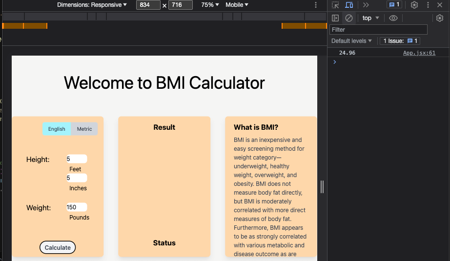
If everything is working fine, your app would look like the image below.

The app with basic HTML and CSS

Refactor the code into the Card component

From the base template that we’ve built above, you will notice that we have three containers that have the same shape and color. Normally, if you find any repetitive code, that’s a great opportunity to refactor.

Let’s refactor the container into its own component – Card.

Create a folder called components under the src folder and make a file Card.jsx.

The app structure after creating the Card component

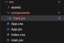
Extract the code for the orange container into the Card.jsx.

const Card = ({ children, className }) => {
const cardClassName = `max-w-sm rounded-lg overflow-hidden shadow-lg bg-orange-200 w-80 h-96 ${className}`;
return <div className={cardClassName}>{children}</div>;
};
export default Card;
view raw Card.jsx hosted with ❤ by GitHub

We use children and className here. Whatever we put in between <Card> and </Card> will be considered as children. The className is to add additional styling for each container.

Now, we use the Card component in App.jsx.

import Card from "./components/Card";
function App() {
return (
<div className="min-h-screen h-screen m-0 bg-stone-100">
<div className="flex h-1/5 justify-center items-center mx-auto">
<h1 className="text-5xl">Welcome to BMI Calculator</h1>
</div>
<div className="flex h-3/5 justify-center items-center mx-auto">
{/* user input card */}
<Card className="flex flex-col">
{/* toggle container */}
{/* main user input section */}
{/* height section */}
{/* unit section */}
{/* weight section */}
{/* unit section */}
{/* some other code here */}
</Card>
{/* bmi number and circle progress bar card */}
<Card className="mx-10 flex flex-col">
{/* progress bar here */}
{/* status here */}
</Card>
{/* explanation card */}
<Card className="flex flex-col">
</Card>
</div>
</div>
);
}
export default App;
view raw App.jsx hosted with ❤ by GitHub

Build A User Input Form Card

We are going to build a form where users input their height and weight. There are two ways to calculate the BMI. One way is called English, which uses feet & inches, and pounds. Another way is called Metric, which uses kilograms and centimeters. We will implement both ways and build a toggle button to let users be able to switch methods.

Build a toggle button for English/Metric

There are many ways to build a toggle button. If you already know a trick to build a toggle button feel free to use it to work that magic. In this article, we are going to utilize peer and peer-checked in TailWind CSS.

import Card from "./components/Card";
function App() {
return (
{/* some other code here */}
{/* user input card */}
<Card className="flex flex-col">
{/* toggle container */}
<div className="px-4 py-4 flex justify-end">
<label
htmlFor="unit-toggle"
className="inline-flex items-center rounded-md cursor-pointer dark:text-gray-800"
>
<input id="unit-toggle" type="checkbox" className="hidden peer" />
<span className="px-4 py-2 text-sm rounded-l-md dark:bg-cyan-200 peer-checked:dark:bg-gray-300">
English
</span>
<span className="px-4 py-2 text-sm rounded-r-md dark:bg-gray-300 peer-checked:dark:bg-cyan-200">
Metric
</span>
</label>
</div>
{/* main user input section */}
</Card>
{/* bmi number and circle progress bar card */}
<Card className="mx-10 flex flex-col">
{/* some other code here */}
</Card>
{/* explanation card */}
<Card className="flex flex-col">
{/* some other code here */}
</Card>
</div>
</div>
);
}
export default App;
view raw App.jsx hosted with ❤ by GitHub

If you want to read more about how peer and peer-modifier works, you can read over this TailWind CSS document. In addition, if you want to explore how to build a toggle button in-depth, I’ve found this well-explained blog post from Medium.

The code above will give you the ability to toggle between English and Metric. Next, we need to make a flag that can tell us whether our current status is English or Metric. So, when it’s toggled, we change the input fields from English and Metric and vice versa. Let’s create a simple state that tracks the status and a handler that handles when the toggle button is clicked.

import { useState } from "react";
import Card from "./components/Card";
function App() {
const [isChecked, setIsChecked] = useState(false);
const handleIsChecked = () => {
setIsChecked(!isChecked);
};
return (
{/* user input card */}
<Card className="flex flex-col">
{/* toggle container */}
<div className="px-4 py-4 flex justify-end">
<label
htmlFor="unit-toggle"
className="inline-flex items-center rounded-md cursor-pointer dark:text-gray-800"
>
<input
id="unit-toggle"
type="checkbox"
className="hidden peer"
onClick={handleIsChecked}
/>
<span className="px-4 py-2 text-sm rounded-l-md dark:bg-cyan-200 peer-checked:dark:bg-gray-300">
English
</span>
<span className="px-4 py-2 text-sm rounded-r-md dark:bg-gray-300 peer-checked:dark:bg-cyan-200">
Metric
</span>
</label>
</div>
{/* main user input section */}
</Card>
{/* bmi number and circle progress bar card */}
<Card className="mx-10 flex flex-col">
</Card>
{/* explanation card */}
<Card className="flex flex-col">
</Card>
</div>
</div>
);
}
export default App;
view raw App.jsx hosted with ❤ by GitHub

Refactor the code into the Toggle component

In our BMI calculator app, we are using only one toggle button, however, a toggle button is a pretty common thing to be used multiple times in any app. Let’s extract the code from App.jsx into the Toggle.jsx component.

The app structure after creating the Toggle component

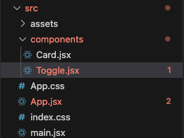
Here is the code for the Toggle.jsx.

const Toggle = ({ handleOnChange }) => {
return (
<div className="px-4 py-4 flex justify-end">
<label
htmlFor="unit-toggle"
className="inline-flex items-center rounded-md cursor-pointer dark:text-gray-800"
>
<input
id="unit-toggle"
type="checkbox"
className="hidden peer"
onChange={handleOnChange}
/>
<span className="px-4 py-2 text-sm rounded-l-md dark:bg-cyan-200 peer-checked:dark:bg-gray-300">
English
</span>
<span className="px-4 py-2 text-sm rounded-r-md dark:bg-gray-300 peer-checked:dark:bg-cyan-200">
Metric
</span>
</label>
</div>
);
};
export default Toggle;

Then, we can use the Toggle component in the App.jsx.

import { useState } from "react";
import Card from "./components/Card";
import Toggle from "./components/Toggle";
function App() {
// some other code here
return (
<div className="min-h-screen h-screen m-0 bg-stone-100">
<div className="flex h-1/5 justify-center items-center mx-auto">
<h1 className="text-5xl">Welcome to BMI Calculator</h1>
</div>
<div className="flex h-3/5 justify-center items-center mx-auto">
{/* user input card */}
<Card className="flex flex-col">
{/* toggle container */}
<Toggle handleOnChange={handleIsChecked} />
{/* main user input section */}
{/* some other code here */}
</Card>
{/* bmi number and circle progress bar card */}
<Card className="mx-10 flex flex-col">
</Card>
{/* explanation card */}
<Card className="flex flex-col">
</Card>
</div>
</div>
);
}
export default App;
view raw App.jsx hosted with ❤ by GitHub

Make input fields for English/Metric

For each method (English or Metric), we need different measurements. For the height, it’s feet and inches for English and centimeters (cm) for Metric. As for the weight, it’s pounds for English and kilograms (kg) for Metric.

Here is the code for input fields for both units.

import { useState } from "react";
import Card from "./components/Card";
function App() {
// some code here
return (
{/* user input card */}
<Card className="flex flex-col">
{/* toggle container */}
{/* main user input section */}
<div className="px-4 py-4 grow flex flex-col justify-evenly">
{/* height section */}
<div className="flex justify-between mb-2">
<div className="w-1/2 ml-6 text-xl">
<span>Height: </span>
</div>
{/* unit section */}
{!isChecked ? (
<div className="w-1/2 flex flex-col ml-6">
<div>
<input
type="number"
id="feet"
className="mb-1 w-14 rounded-lg"
/>
<label className="ml-2">Feet</label>
</div>
<div>
<input
type="number"
id="inches"
className="mb-1 w-14 rounded-lg"
/>
<label className="ml-2">Inches</label>
</div>
</div>
) : (
<div className="w-1/2 flex flex-col ml-6">
<div>
<input
type="number"
id="cm"
className="mb-1 w-14 rounded-lg"
/>
<label className="ml-2">cm</label>
</div>
</div>
)}
</div>
{/* weight section */}
<div className="flex justify-between">
<div className="w-1/2 ml-6 text-xl">
<span>Weight: </span>
</div>
{/* unit section */}
{!isChecked ? (
<div className="w-1/2 flex flex-col ml-6">
<div>
<input
type="number"
id="pounds"
className="mb-1 w-14 rounded-lg"
/>
<label className="ml-2">Pounds</label>
</div>
</div>
) : (
<div className="w-1/2 flex flex-col ml-6">
<div>
<input
type="number"
id="kg"
className="mb-1 w-14 rounded-lg"
/>
<label className="ml-2">kg</label>
</div>
</div>
)}
</div>
</div>
{/* button here */}
</Card>
{/* bmi number and circle progress bar card */}
<Card className="mx-10 flex flex-col">
</Card>
{/* explanation card */}
<Card className="flex flex-col">
</Card>
</div>
</div>
);
}
export default App;
view raw App.jsx hosted with ❤ by GitHub

Now, if you toggle the button between English and Metric, you should be able to see the measurements change. We are using the isChecked state to conditionally render the measurements.

Another thing that I’ve done for better visibility of the input fields is removing the arrows that are used to increment or decrement the values. The arrows are shown because our input fields’ type is number. We can remove them by adding an extra style in index.css.

@layer utilities {
input[type="number"]::-webkit-inner-spin-button,
input[type="number"]::-webkit-outer-spin-button {
@apply appearance-none;
}
}
@tailwind base;
@tailwind components;
@tailwind utilities;
view raw index.css hosted with ❤ by GitHub

The next step is to implement the functionality. When the user enters the numbers into the input fields, we need to store the values in our state so that we can calculate the BMI when the calculate button is clicked.

import { useState } from "react";
import Card from "./components/Card";
function App() {
const [isChecked, setIsChecked] = useState(false);
const [measurement, setMeasurement] = useState({
feet: "",
inches: "",
pounds: "",
cm: "",
kg: "",
});
const handleIsChecked = () => {
setIsChecked(!isChecked);
setMeasurement({
feet: "",
inches: "",
pounds: "",
cm: "",
kg: "",
});
};
// handle input fields change
const handleChange = (e) => {
const targetId = e.target.id;
const targetValue = e.target.value;
const numberLimit = {
feet: 1,
inches: 2,
pounds: 3,
cm: 3,
kg: 3,
};
const regex = new RegExp(`^[0-9]{0,${numberLimit[targetId]}}$`);
if (targetValue === "" || regex.test(targetValue)) {
setMeasurement((prev) => ({
...prev,
[targetId]: targetValue,
}));
}
};
// Prevent typing dot
const handleKeyDown = (e) => {
if (e.key === ".") {
e.preventDefault();
}
};
return (
{/* some other code here */}
{/* user input card */}
<Card className="flex flex-col">
{/* toggle container */}
{/* main user input section */}
<div className="px-4 py-4 grow flex flex-col justify-evenly">
{/* height section */}
<div className="flex justify-between mb-2">
<div className="w-1/2 ml-6 text-xl">
<span>Height: </span>
</div>
{/* unit section */}
{!isChecked ? (
<div className="w-1/2 flex flex-col ml-6">
<div>
<input
type="number"
id="feet"
className="mb-1 w-14 rounded-lg"
onChange={handleChange}
onKeyDown={handleKeyDown}
value={measurement.feet}
/>
<label className="ml-2">Feet</label>
</div>
<div>
<input
// other attributes here
onChange={handleChange}
onKeyDown={handleKeyDown}
value={measurement.inches}
/>
<label className="ml-2">Inches</label>
</div>
</div>
) : (
<div className="w-1/2 flex flex-col ml-6">
<div>
<input
// other attributes here
onChange={handleChange}
onKeyDown={handleKeyDown}
value={measurement.cm}
/>
<label className="ml-2">cm</label>
</div>
</div>
)}
</div>
{/* weight section */}
<div className="flex justify-between">
<div className="w-1/2 ml-6 text-xl">
<span>Weight: </span>
</div>
{/* unit section */}
{!isChecked ? (
<div className="w-1/2 flex flex-col ml-6">
<div>
<input
// other attributes here
onChange={handleChange}
onKeyDown={handleKeyDown}
value={measurement.pounds}
/>
<label className="ml-2">Pounds</label>
</div>
</div>
) : (
<div className="w-1/2 flex flex-col ml-6">
<div>
<input
// other attributes here
onChange={handleChange}
onKeyDown={handleKeyDown}
value={measurement.kg}
/>
<label className="ml-2">kg</label>
</div>
</div>
)}
</div>
</div>
{/* calculate button here */}
</Card>
{/* bmi number and circle progress bar card */}
<Card className="mx-10 flex flex-col">
</Card>
{/* explanation card */}
<Card className="flex flex-col">
</Card>
</div>
</div>
);
}
export default App;
view raw App.jsx hosted with ❤ by GitHub

Let me explain what’s happening in the code above. Two methods are added to handle the change of input fields. The handleChange is called whenever the change is made to the input fields. We are applying some limitations to each measurement (i.e. the value of the feet can be only in the range of 0 to 9). The handleKeyDown prevents the users from typing the dot (.) for the simplicity of the application.

The handleIsChecked is slightly modified so that when the toggle button is clicked, we empty the input values from the previous unit (i.e. if we switch from English to Metric, the values the user typed in English become blank).

Finally, we attach the handlers to each input’s onClick and onKeyDown events.

Great! The functionality of the input fields is successfully implemented. But again, you might have noticed that there is so much repetitive code. Like we always do, it’s time to refactor and clean up our code.

Refactor the code into the Input component

Since we require users to enter values into our input fields, we have quite a bit of input and label tags. We are going to make a template for those in the Input.jsx and use it anywhere that we need.

const Input = ({ id, label, value, handleOnChange, handleOnKeyDown }) => {
return (
<div>
<input
type="number"
id={id}
className="mb-1 w-14 rounded-lg"
onChange={handleOnChange}
onKeyDown={handleOnKeyDown}
value={value}
/>
<label className="ml-2">{label}</label>
</div>
);
};
export default Input;
view raw Input.jsx hosted with ❤ by GitHub

Then, we are going to replace any input and label tags in our App.jsx.

import { useState } from "react";
import Card from "./components/Card";
import Toggle from "./components/Toggle";
import Input from "./components/Input";
function App() {
// some code here
return (
<div className="min-h-screen h-screen m-0 bg-stone-100">
{/* some code here */}
<div className="flex h-3/5 justify-center items-center mx-auto">
{/* user input card */}
<Card className="flex flex-col">
{/* toggle container */}
{/* main user input section */}
<div className="px-4 py-4 grow flex flex-col justify-evenly">
{/* height section */}
<div className="flex justify-between mb-2">
<div className="w-1/2 ml-6 text-xl">
<span>Height: </span>
</div>
{/* unit section */}
{!isChecked ? (
<div className="w-1/2 flex flex-col ml-6">
<Input
id="feet"
label="Feet"
value={measurement.feet}
handleOnChange={handleChange}
handleOnKeyDown={handleKeyDown}
/>
<Input
id="inches"
label="Inches"
value={measurement.inches}
handleOnChange={handleChange}
handleOnKeyDown={handleKeyDown}
/>
</div>
) : (
<div className="w-1/2 flex flex-col ml-6">
<Input
id="cm"
label="cm"
value={measurement.cm}
handleOnChange={handleChange}
handleOnKeyDown={handleKeyDown}
/>
</div>
)}
</div>
{/* weight section */}
<div className="flex justify-between">
<div className="w-1/2 ml-6 text-xl">
<span>Weight: </span>
</div>
{/* unit section */}
{!isChecked ? (
<div className="w-1/2 flex flex-col ml-6">
<Input
id="pounds"
label="Pounds"
value={measurement.pounds}
handleOnChange={handleChange}
handleOnKeyDown={handleKeyDown}
/>
</div>
) : (
<div className="w-1/2 flex flex-col ml-6">
<Input
id="kg"
label="kg"
value={measurement.kg}
handleOnChange={handleChange}
handleOnKeyDown={handleKeyDown}
/>
</div>
)}
</div>
</div>
{/* button code here */}
</Card>
{/* bmi number and circle progress bar card */}
<Card className="mx-10 flex flex-col">
</Card>
{/* explanation card */}
<Card className="flex flex-col">
</Card>
</div>
</div>
);
}
export default App;
view raw App.jsx hosted with ❤ by GitHub

With this refactoring, our code becomes more clear and shorter!

Calculate the BMI

We have all the input fields set up for our users to input their height and weight, and now it’s time to implement the logic to calculate the BMI with the given inputs. We are going to log the BMI on our console when a button is clicked for now. The BMI result will be used later when we implement the progress bar.

It’s a good idea to separate the code for its own usage. Since the logic will not contain any code that is related to render components, we are going to create a separate file for all the logic that we are going to use.

Let’s create a folder called utils and a file called helpers.js inside the utils folder.

The app structure after creating the helpers.js

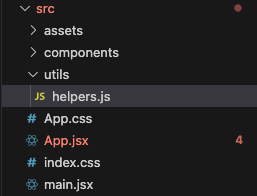
Then, implement the logic to calculate the BMI depending on the method chosen (English or Metric).

const calculateBMI = (measurement, isChecked) => {
let { feet, inches, pounds, cm, kg } = measurement;
feet = parseInt(feet, 10);
inches = parseInt(inches, 10);
pounds = parseInt(pounds, 10);
cm = parseInt(cm, 10);
kg = parseInt(kg, 10);
let result = 0;
if (!isChecked) {
result = calculateEnglish(feet, inches, pounds);
} else {
result = calculateMetric(cm, kg);
}
result = roundToDecimal(result);
return result;
};
const calculateEnglish = (feet, inches, pounds) => {
const result = (pounds / Math.pow(feet * 12 + inches, 2)) * 703;
return result;
};
const calculateMetric = (cm, kg) => {
const result = kg / Math.pow(cm / 100, 2);
return result;
};
const roundToDecimal = (number) => {
const result = number.toFixed(2);
return result;
};
export { calculateBMI };

We can use the calculation method by importing it into the App.jsx.

import { useState } from "react";
import Card from "./components/Card";
import Toggle from "./components/Toggle";
import Input from "./components/Input";
import { calculateBMI } from "./utils/helpers";
function App() {
// some other code here
const [BMI, setBMI] = useState(0);
const handleSubmit = () => {
const BMI = calculateBMI(measurement, isChecked);
console.log(BMI);
setBMI(BMI);
};
return (
<div className="min-h-screen h-screen m-0 bg-stone-100">
{/* some other code here */}
<div className="flex h-3/5 justify-center items-center mx-auto">
{/* user input card */}
<Card className="flex flex-col">
{/* toggle container */}
<Toggle handleOnChange={handleIsChecked} />
{/* main user input section */}
<div className="px-4 pt-4 pb-2 flex justify-center items-center mx-auto">
<button
className="inline-block bg-white rounded-full px-3 py-1 text-md font-semibold text-gray-700 border-black border-2
hover:bg-gray-100"
onClick={handleSubmit}
>
Calculate
</button>
</div>
</Card>
{/* bmi number and circle progress bar card */}
<Card className="mx-10 flex flex-col">
</Card>
{/* explanation card */}
<Card className="flex flex-col">
</Card>
</div>
</div>
);
}
export default App;
view raw App.jsx hosted with ❤ by GitHub

If everything is working well, you should be able to see the BMI result on your console when you click the calculate button.

The BMI result after successful calculation

Build A Result Card

At this point in the tutorial, we’ve successfully calculated the BMI for our users. However, let’s give our users a more interactive and fun experience by implementing a circular progress bar that changes when the BMI is calculated.

We are going to use an npm package called react-circular-progressbar. This package is highly configurable so that we can modify the bar as we need. If you want to read more about this package, you can visit the official npm package site.

First, let’s install the package.

npm install --save react-circular-progressbar

Then, we are going to create a progress bar and BMI number along with the BMI status.

// some import here
import { CircularProgressbar, buildStyles } from "react-circular-progressbar";
import "react-circular-progressbar/dist/styles.css";
function App() {
const [BMI, setBMI] = useState(0);
//some code here
return (
<div className="min-h-screen h-screen m-0 bg-stone-100">
<div className="flex h-3/5 justify-center items-center mx-auto">
{/* user input card */}
<Card className="flex flex-col">
</Card>
{/* bmi number and circle progress bar card */}
<Card className="mx-10 flex flex-col">
<div className="px-6 py-4 justify-center items-center mx-auto flex flex-col">
<div className="font-bold text-xl mb-2">
<span>Result</span>
</div>
</div>
{/* progress bar here */}
<div className="px-6 py-4 justify-center items-center mx-auto h-1/2 grow">
<CircularProgressbar
value={BMI}
text={`${BMI}`}
circleRatio={0.6}
styles={buildStyles({
rotation: 0.7,
strokeLinecap: "round",
trailColor: "#eee",
pathColor: "#eee",
textColor: "#000",
})}
minValue={0}
maxValue={40}
/>
</div>
{/* status here */}
<div className="px-6 py-4 justify-center items-center mx-auto flex flex-col">
<div className="font-bold text-xl mb-2">
<span>Status</span>
</div>
</div>
</Card>
{/* explanation card */}
<Card className="flex flex-col">
</Card>
</div>
</div>
);
}
export default App;
view raw App.jsx hosted with ❤ by GitHub

Now, you should be able to see a circular progress bar.

Successfully rendered progress bar

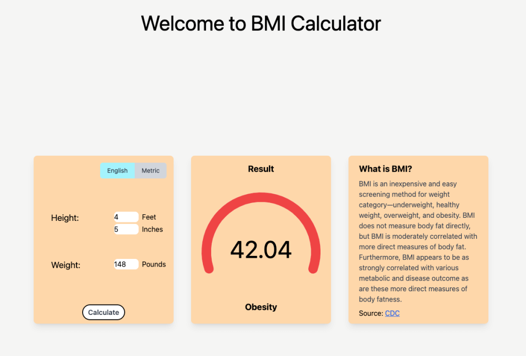
Awesome, now let’s change the color of the progress bar and the status underneath it depending on the BMI result.

Let’s write some code to change the color of the bars in the helpers.js file.

// some other code here
const capitalizeFirstLetter = (str) => {
const result = str.charAt(0).toUpperCase() + str.slice(1);
return result;
};
const pickColor = (bmi) => {
let result = {};
const weightStatus = {
underweight: { max: 18.5, color: "#fddf47" },
healthy: { max: 24.99, color: "#4ade80" },
overweight: { max: 29.99, color: "#fddf47" },
obesity: { max: Infinity, color: "#ef4444" },
};
const status = Object.keys(weightStatus).find(
(key) => bmi <= weightStatus[key].max
);
result = {
status: status,
color: weightStatus[status].color,
};
return result;
};
export { calculateBMI, capitalizeFirstLetter, pickColor };

Then, we can utilize these methods in the App.jsx.

import {
calculateBMI,
capitalizeFirstLetter,
pickColor,
} from "./utils/helpers";
import { CircularProgressbar, buildStyles } from "react-circular-progressbar";
import "react-circular-progressbar/dist/styles.css";
function App() {
// some other code here
const [BMI, setBMI] = useState(0);
const [indication, setIndication] = useState({
status: "",
color: "",
});
const handleSubmit = () => {
const BMI = calculateBMI(measurement, isChecked);
const status = pickColor(BMI);
setBMI(BMI);
setIndication({
status: status.status,
color: status.color,
});
};
return (
<div className="min-h-screen h-screen m-0 bg-stone-100">
{/* some other code here */}
<div className="flex h-3/5 justify-center items-center mx-auto">
{/* user input card */}
<Card className="flex flex-col">
{/* some other code here */}
</Card>
{/* bmi number and circle progress bar card */}
<Card className="mx-10 flex flex-col">
<div className="px-6 py-4 justify-center items-center mx-auto flex flex-col">
<div className="font-bold text-xl mb-2">
<span>Result</span>
</div>
</div>
{/* progress bar here */}
<div className="px-6 py-4 justify-center items-center mx-auto h-1/2 grow">
<CircularProgressbar
value={BMI}
text={`${BMI}`}
circleRatio={0.6}
styles={buildStyles({
rotation: 0.7,
strokeLinecap: "round",
trailColor: "#eee",
pathColor: `${indication.color}`,
textColor: "#000",
})}
minValue={0}
maxValue={40}
/>
</div>
{/* status here */}
<div className="px-6 py-4 justify-center items-center mx-auto flex flex-col">
<div className="font-bold text-xl mb-2">
<span>{capitalizeFirstLetter(indication.status)}</span>
</div>
</div>
</Card>
{/* explanation card */}
<Card className="flex flex-col">
</Card>
</div>
</div>
);
}
export default App;
view raw App.jsx hosted with ❤ by GitHub

If you enter the height and weight, then voilà!

Successfully working progress bar with BMI status

The features of our BMI calculator are done. But, before we wrap this up, let’s refactor the progress bar into a separate component.

Refactor the code into the ProgressBar component

Create a file called ProgressBar.jsx under the components folder.

The app structure after creating the ProgressBar component

Here is the code for the ProgressBar.jsx.

import { CircularProgressbar, buildStyles } from "react-circular-progressbar";
import "react-circular-progressbar/dist/styles.css";
const ProgressBar = ({ BMI, indication }) => {
return (
<CircularProgressbar
value={BMI}
text={`${BMI}`}
circleRatio={0.6}
styles={buildStyles({
rotation: 0.7,
strokeLinecap: "round",
trailColor: "#eee",
pathColor: `${indication.color}`,
textColor: "#000",
})}
minValue={0}
maxValue={40}
/>
);
};
export default ProgressBar;

Then, we can use this in the App.jsx.

// some other import here
import {
calculateBMI,
capitalizeFirstLetter,
pickColor,
} from "./utils/helpers";
import ProgressBar from "./components/ProgressBar";
function App() {
// some other code here
return (
<div className="min-h-screen h-screen m-0 bg-stone-100">
{/* some other code here */}
<div className="flex h-3/5 justify-center items-center mx-auto">
{/* user input card */}
<Card className="flex flex-col">
</Card>
{/* bmi number and circle progress bar card */}
<Card className="mx-10 flex flex-col">
<div className="px-6 py-4 justify-center items-center mx-auto flex flex-col">
<div className="font-bold text-xl mb-2">
<span>Result</span>
</div>
</div>
{/* progress bar here */}
<div className="px-6 py-4 justify-center items-center mx-auto h-1/2 grow">
<ProgressBar BMI={BMI} indication={indication} />
</div>
{/* status here */}
<div className="px-6 py-4 justify-center items-center mx-auto flex flex-col">
<div className="font-bold text-xl mb-2">
<span>{capitalizeFirstLetter(indication.status)}</span>
</div>
</div>
</Card>
{/* explanation card */}
<Card className="flex flex-col">
</Card>
</div>
</div>
);
}
export default App;
view raw App.jsx hosted with ❤ by GitHub

Conclusion

Great job on making it through until the end! This is the end of our fourth React JS step-by-step tutorial.

The fully working BMI calculator app

From this tutorial, we were able to learn the following:
– How to set up React JS with Vite
– How to build a toggle button with CSS (ft. TailWind CSS)
– How to build a user input form
– How to refactor code as separate components
– How to build a circular progress bar using react-circular-progressbar package
– How to dynamically render the progress bar and the status

If you’re aiming to enhance your skills even further, you’re welcome to add extra features to the BMI calculator app we’ve already built. Some ideas that I can think of to improve this app are like following:
– Allow users to be able to calculate when the enter is hit after filling up the input fields
– Add an icon for description so that when it’s clicked, it expands and collapses the description card
– Add a dark mode feature

I hope you enjoyed building the BMI calculator app and thank you again for reading. If you are interested in making more React JS projects for beginners, then you can check out our 10 Best React JS Projects For Beginners In 2023 post.

If you have thoughts on this, be sure to leave a comment.

I also write articles on Medium, so make sure to check them out on medium/@codingnotes.

Happy coding!

Leave a Comment

Your email address will not be published. Required fields are marked *